Designing a web report to analyze Instagram account performance
Overview
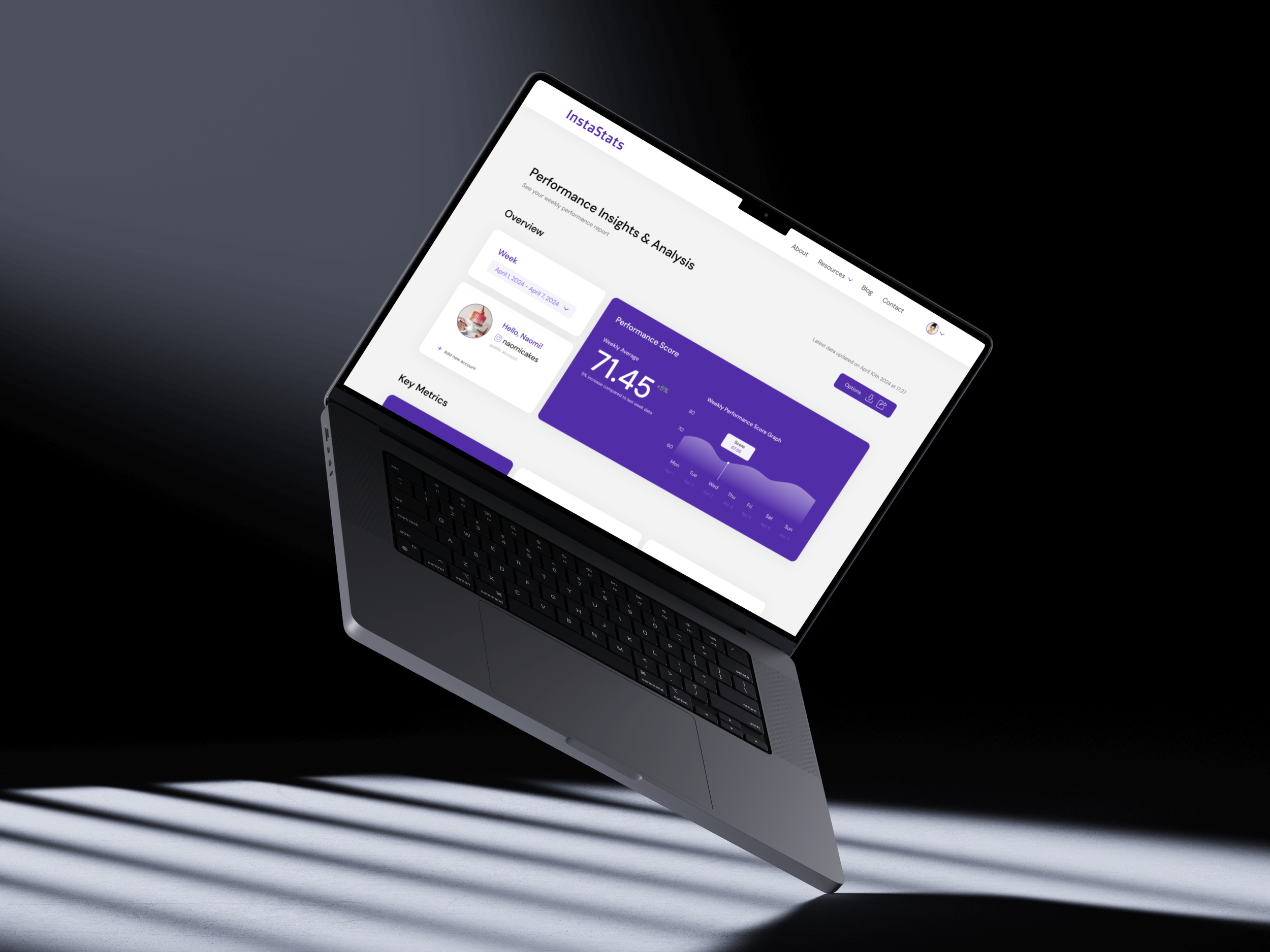
In this personal project, my main objective was to design a web report that effectively reflects key Instagram data insights for tracking account performance. This report is intended to help users understand how well their content is engaging their audience.
PROJECT TYPE
Web Design
(Personal Project)
YEAR
May 2024
Complete web report walkthrough
1
This was my first time designing a web report, and initially, I wasn’t sure where to start.
So before delving into the design process, I decided to start with some research. This included analyzing external sources on web reports or dashboards, reviewing examples on Awwwards, and browsing Pinterest to get a sense of the overall feel I wanted to achieve.
Useful sources:
Getting started
Challenge #1


The goal of a report is to simplify complex information. The interface should reduce the users' cognitive load.
Dashboards are displayed on one screen, while reports include more comprehensive data over a period and are scrollable.
A proper approach to data visualization is crucial for establishing a solid foundation for report design.

Original data spreadsheet with all insights incorporated into the report.
2
Some key insights from research
3
Establishing a clear visual / information hierarchy
Challenge #2
The next step in my process was to incorporate these research insights into my report. At this point, I realized the importance of defining a clear structural layout—one that is easy to understand and invites iteration and feedback. To achieve this, I proceeded with creating wireframes, which are essential in the early stages of development to establish the basic structure of a page before adding visual design and content.

First wireframe iteration + my sticky notes during the process
Feedback
The first iteration helped me visualize initial ideas for the report structure. However, after receiving feedback from fellow designers, I discovered that this version lacked specificity and was too broad. While it served as a good starting point, it wasn't refined enough to move forward with the visual design. The feedback I received emphasized the need for medium-fidelity wireframes, where I could begin planning the actual content based on the data spreadsheet.

Final wireframe iteration + my sticky notes during the process
Finalizing the structure
In the second iteration, I created a more defined structure that allowed me to group certain data insights, establish a clear hierarchy, and organize the content more effectively. This refinement was crucial for laying the groundwork for the subsequent stages of the project.
4
How can I present complex data so that it's both visually appealing and functional?
Data visualization
In my report design, I included a variety of graphs and visual elements aimed at making complex data more accessible. The main goal was to help decision-makers quickly identify patterns and trends, or grasp intricate concepts that might be overlooked in traditional, text-heavy formats. Through the use of charts and graphs, I ensured that critical insights were visually highlighted, allowing for more intuitive understanding of the given data.

Graphs and charts included in the report
5
Web reports can be overwhelming for users, especially if the data is displayed all at once
Progressive disclosure
All data indicators on the graphs are displayed only on hover. This feature helps declutter the page using "progressive disclosure," creating a user-centric environment. By prioritizing user attention, it helps avoid mistakes and save time.
6
I was unsure how to approach the “missing phone” and “missing email” data

Recommendations
Since the spreadsheet contained some data about the phone number and email address, I decided to use this opportunity to create a recommendations section reminding users that they have not yet added their contact info.

7
Learning takeways
I learned the importance of conducting research and reviewing existing examples to gain a solid understanding before beginning the design process.
Starting with wireframes is crucial for establishing a clear structure, which facilitates a smoother visual design phase.
Web reports help users by structuring data in a clear and easy-to-navigate manner. This can be achieved by using progressive disclosure and effective data visualization.
If I were to continue working on this project, I would conduct user research and usability testing to gather both quantitative and qualitative data, which would help in iterating and improving the design.